 Writer – Sam Humphries
Art – John Timms
*This review may contain spoilers.
While the eyes of the DC Universe fixate on the events and controversy surrounding holy Batrimony, Sam Humphries and a new creative team move Harley Quinn in an interesting, new direction.
Readers are treated to a vacationing Harley who is trying unsuccessfully to put the stresses of the world momentarily behind her. Her quest for beachy zen is brief and quickly interrupted. Surprisingly, Harley finds herself recruited for a new gig in another dimension. Soon, she embraces a new type of rejuvenation – as one of Granny Goodness’ Female Furies!
The story was eccentric and pure Harley. It’s upside-down, yet incorporated heart and humor in the midst of a topsy-turvy package. While set in another dimension, the narrative seemed quite grounded – as if this arch has something important to show readers. My hope is it adds additional layers to Harley Quinn’s character and motivations.
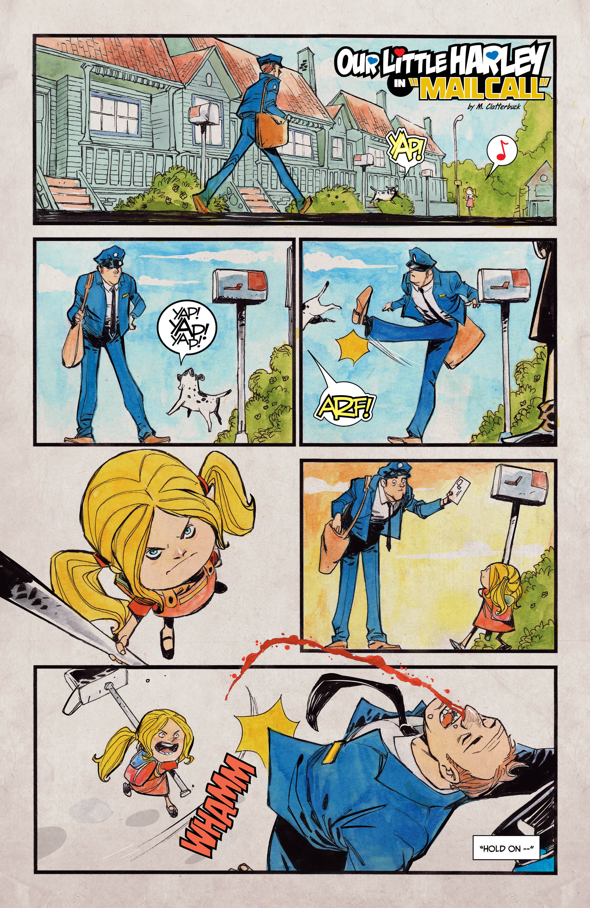
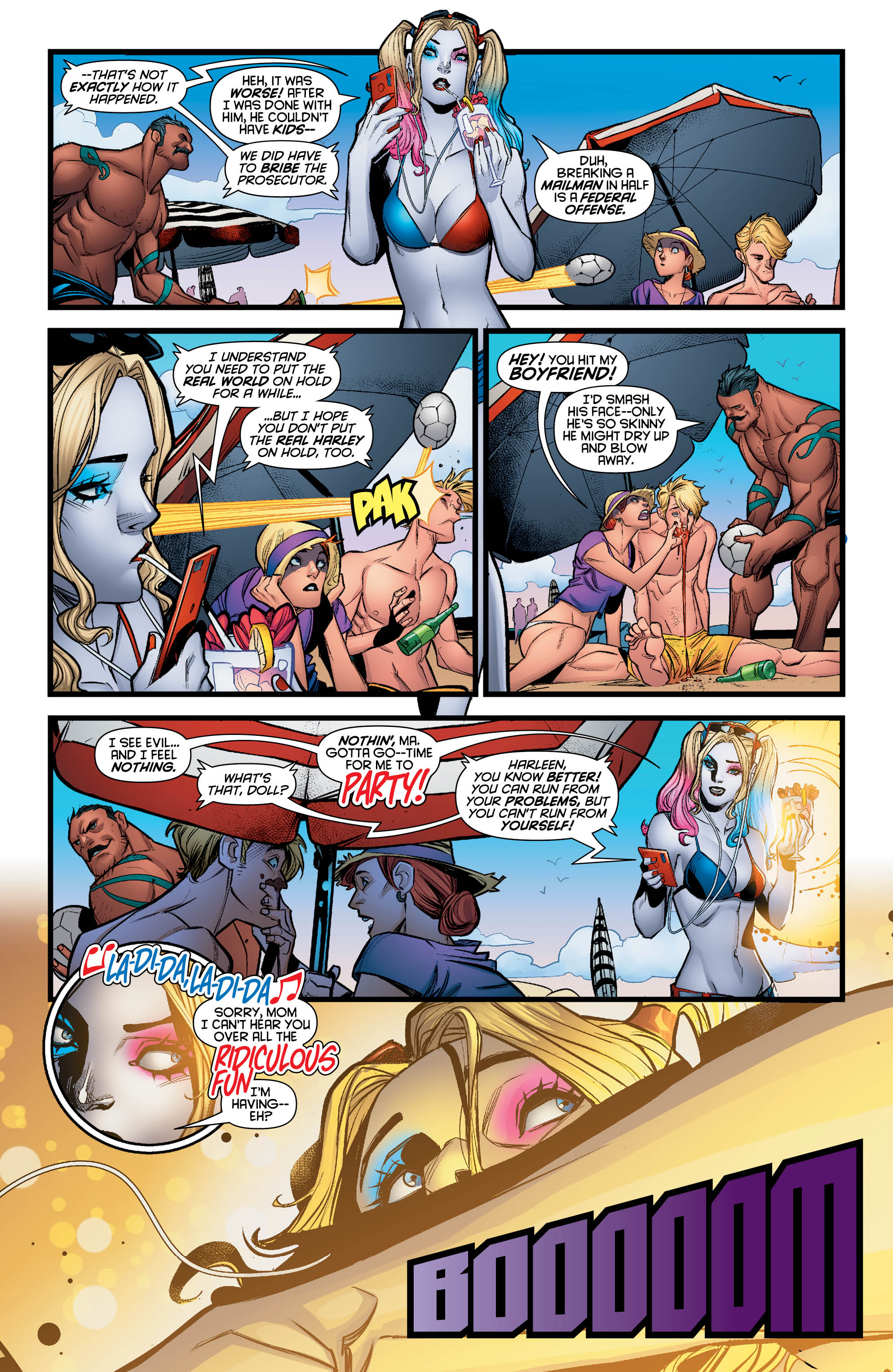
Artistically, Harley Quinn #45 felt fresh and clean. Crisp lines, bright colors, and creatively rendered panels appeared tailor-made for the maniacal Harley. Intricate details abound, as well. A particular kitchen scene includes the reflection of a character on its freshly shined floor. Incredible! Additionally, I thoroughly enjoyed the one-page short which communicated a past event from Harley’s life and another which depicted a clever dream sequence. I thought these were an incredibly creative choice and a nice touch that translated well.
The issue was beautiful throughout and drew my eyes through its pages with delight. Dave Sharpe’s lettering is particularly praise-worthy – and there’s loads of it! So many varieties of expression are captured creatively in differentiated speech bubbles, fonts, and colors. The letters add another dimension to the panels and pages.
Conclusion
Overall, Harley Quinn #45 was an enjoyable issue. The new creative team pulled together a compelling story without limiting all the fun and fury Harley’s character has to offer. Harley is such an eccentric and unpredictable character that writing her could well be a challenge. Sam Humphries seems up for the task and delivered a fun issue. Harley Quinn #45 was simply a beautifully drawn, colored, and lettered issue. Everything tied together in just the right ways. While I’m not keen on most stories involving Apokolips, it provided an interesting backdrop for the start of this arch. I’d love to see Harley’s intelligence depicted on equal footing as her outbursts. A more calculated Harley would be fierce! It will be interesting to see where Humphries and crew take this next.

Images courtesy of DC Entertainment.


