“Multiverse’s End”
 Writer: James Tynion IV
Artist: Juan Gedeon
Color Artist: Mike Spicer
Letterer: Russ Wooton
Review by Steve J. Ray
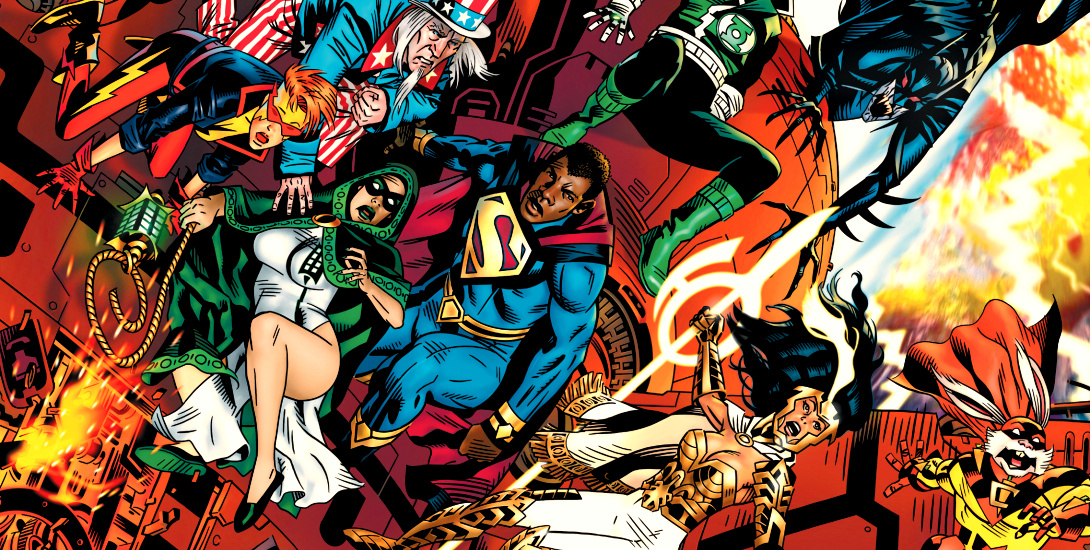
Dark Nights: Death Metal – Multiverse’s End is here, and it brings with it many favorite, and other, sadly long forgotten, DC characters.
The official solicitation for the book reads:
Perpetua, mother of all existence, has culled all life and creation in the Multiverse, condensing all beings to one planet: Earth-Prime. In her quest for power and dominance, she rules absolutely and in totality, using her children – the Monitors and Anti-Monitors – as her heralds, and destructors. A group of heroes has banded together across multiple worlds in a last-ditch effort to stop her from destroying all of existence: Owlman, President Superman, Iris West, Captain Carrot, Guy Gardner, and others have chosen to make their final stand, in a battle they’re destined to lose!
Sound great, right? James Tynion’s script lives up to the hype, and we get a solid, self contained romp of a tale from him. Owlman, the original evil Batman, truly shines, as do two great Green Lanterns, and a parallel world Flash. Sadly, I didn’t really like the art in this issue anywhere near as much as the story.


Like A Sore Thumb
So far, all the one shots and spin offs from Dark Nights: Death Metal have looked gorgeous, and been really great reads, too. While this story’s great, it doesn’t compare visually to what we’ve seen from the rest of the saga. Don’t get me wrong, the art isn’t bad, by any stretch of the imagination, but when you’re treated to tales by luminaries like Greg Capullo, Eddy Barrows, and Francis Manapul, art that’s just good doesn’t quite cut it.
Artist, Juan Gedeon, is very talented, and his takes on Owlman, Guy Gardner, President Superman, and Captain Carrot in particular, are quite cool. The drawback to me is that the art felt scrappy, cartoony, or even rushed. If this was a Zoo crew mini-series, then I wouldn’t be quite so critical, but as part of a massive, company-wide crossover, the differences between this issue and its compatriots are glaring.
To further rub salt on the wound, I also didn’t like Russ Wooton’s lettering. Sorry, team. While he perhaps meant for the book to look hand lettered, trying and invoke the comics of the Captain Carrot era, I far prefer the crisp, clean, easier to read style of up to date digital lettering. That’s a sentence I never thought I’d write.
There is a silver lining, though. One thing that truly is fantastic, is Mike Spicer’s color work. His energy, and lighting effects really elevate the line art, but I would expect nothing less from this talented artist. His work always impresses.
Conclusion
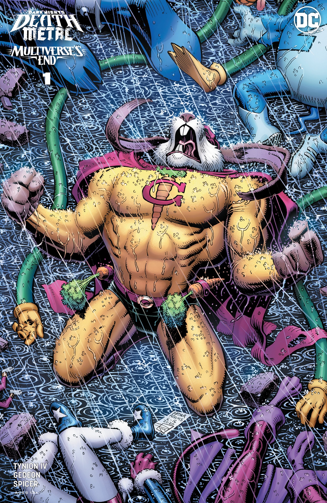
Dark Nights: Death Metal – Multiverse’s End is a terrific read, and still worth picking up, particularly if you’re a hopeless completeist like I am. While the visuals let it down slightly – just my opinion – the book still has charm aplenty, and I will pick up any comic featuring Captain Carrot. The variant cover is a thing of beauty, and well worth the price of admission on its own merits.
While its no masterpiece, this issue is still well above average.

Images Courtesy of DC Entertainment