 Holy company-wide rebranding, Batman! After 18 months, DC Comics will be dropping the “Rebirth” banner and logo from all its covers, starting this month! Yes, the now familiar blue banner will soon be consigned to history, along with the DC starred bullet and the old Comics Code Authority seal of approval.
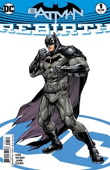
While this may be seen as a bold move, taking away a very prominent feature that distinguishes DC books from those of its rivals, it is a welcome one. The one drawback of the logo/banner as it stood, was that it ate a fairly sizeable chunk of cover artwork. From now on, fans will see cover art that takes up a much larger page area.
I, for one, welcome this move.
The DC Universe: Rebirth has been one of the most successful comic-book re-brandings of recent years. The amalgamation of the pre-Flashpoint and New 52 continuities has breathed new life into our favorite titles, and characters. While the logo/banner design was strong, and eye-catching, replacing it after a year and half is a great idea.


Banner Headlines
The new cover layout is reminiscent of comics from the ’80s and ’90s, which brings a warm nostalgic glow, at least to this old-time comics fan. The boxes which will now appear in just the top, left hand corner of the covers, are both brand enhancing, and aesthetically pleasing. The DC Logo at the top, followed by the issue number, and character/team logo works well, in my eyes.
But what do you all think? Too much too soon? Just right? Totally brilliant move? Major Disaster? Let us have your feedback. It would be great to hear whether you think this is marketing madness, or artistic genius.