“Heroes In Crisis” – Part Five
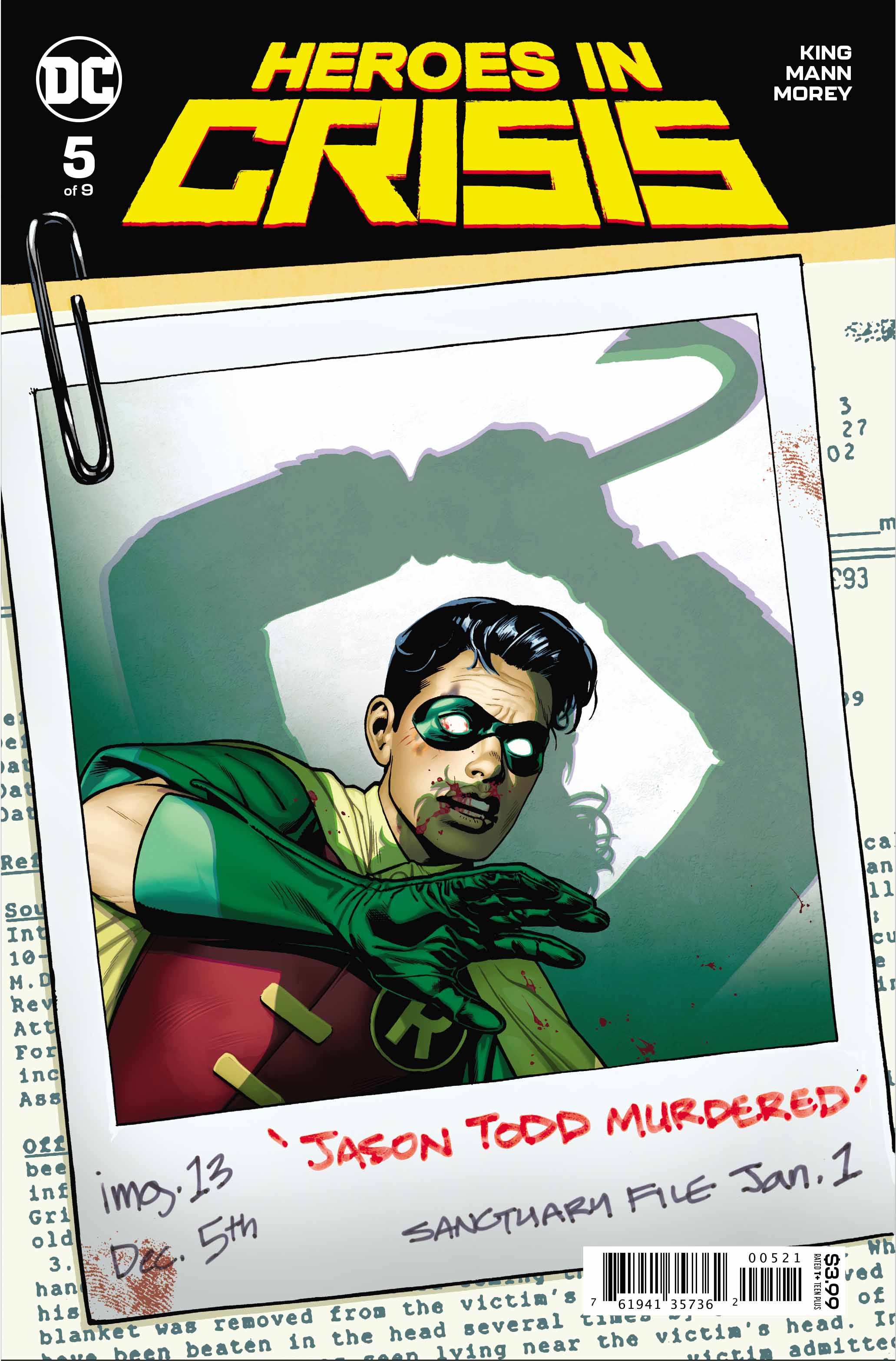 Writer: Tom King
Artists: Clay Mann & Travis Moore
Color Artist: Tomeu Morey
Letterer: Clayton Cowles
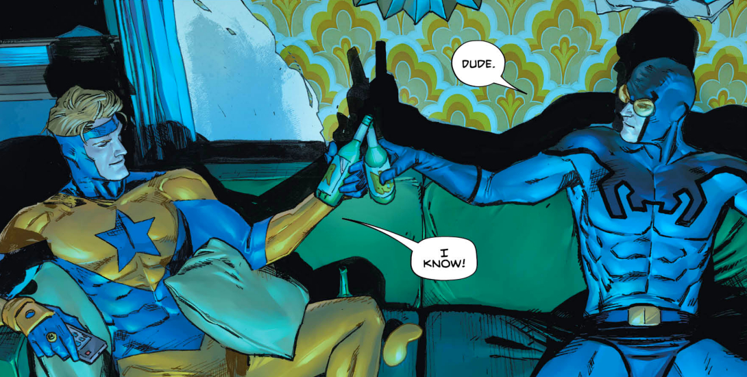
Deep, within the layers of darkness and soul searching that Heroes In Crisis is becoming renowned for, there are also some great, light touches. The subject of PTSD is a serious one, both in this comic and in the real world. Having friends and an outlet to vent trauma is incredibly important, so seeing Booster reunited with Blue Beetle provides him, and the reader, with much needed, and highly welcome, relief.
Tom King is writing some dark stuff, but not so dark that he brings his audience down. His character moments with both Blue and Gold and, the even odder couple of Harley and Batgirl, help lift the book and make it more palatable.
An Eye For Detail
Another source of joy in this issue is the truly exceptional art of Clay Mann, Travis Moore and Tomeu Morey. Damn, dudes… you’re on fire! From Clay’s incredible double splash over pages two and three (with the hidden message that almost broke Twitter) the congregation of Bats on page 5, and Harley on page 10, we see some of the finest anatomy in all comics. Harley and Batgirl’s rooftop chase and the gorgeous splash on pages 16 and 17 aren’t just great comics art, they’re ART… period.
Changing artists mid-book would usually bother the living bejeezus out of me, but when the artists in question are Clay Mann and Travis Moore? Then I just shut up and let them get on with it. Both these great talents work together flawlessly in this issue. Travis’ pages featuring Superman and Lois are intimate and gorgeous, where his action pages featuring Booster and Flash are kinetic and supercharged… quite literally.


Color Commentary
For anyone wondering how much of an impact a colorist makes on the finished comic, then this series is one that everyone should look at. Would you have even noticed that this book had been drawn by two artists if the color hadn’t unified both men’s work? Not just that; the light, texture and atmosphere of Tomeu Morey’s colors don’t just enhance the line art, they elevate it. You can truly feel that Booster and Blue are watching TV on pages 2 and 3, and looking at computer monitors on page 15. Look at the the blur of movement on page 17, and the folds/wrinkles on Superman’s uniform on page 20… sublime.
Letterer Clayton Cowles is no slouch either. ZZZZAPPP… you’ll believe a droid can swear. Uh-oh, here comes the hammer! Thanks, Mr. C.
Seeing the Man Of Steel humbled in this issue was incredible. If you read all of the press conference in Superman’s voice, while absorbing all the images given to us by the art team, I’m sure you’ll be moved. Seeing the most powerful being on the planet reduced almost to tears is humbling, and powerful.
Speaking of powerful; Booster’s revelation and Harley’s confession session on the last two pages have really thrown the cat amongst the pigeons. What happened at Sanctuary? Just when I thought the Joker couldn’t be more disturbing. Chilling stuff.


Conclusion
This series is setting the bar really high, in terms of script and visuals. It’s also pushing the boundaries of what comics are capable of, as a storytelling medium. This isn’t a comic that I would give a kid to read, so Bill Maher can stick that in his pipe and smoke it. Some people won’t accept that comics can be as well written and engaging as prose; I humbly and wholeheartedly disagree. Some would scream “But they have pictures!” I would say , “So do movies, and aren’t some of those brilliantly written? Does the fact that they have images negate the writing?” No… and it’s the same with comics. This medium is akin to cinema for me, but with unlimited imagination comes unfettered storytelling and a limitless SFX budget.
Comics forever!
 Images Courtesy Of DC Entertainment