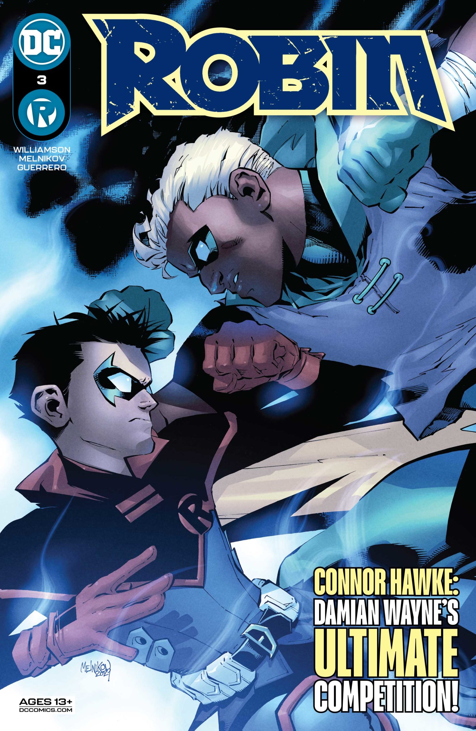
“New Friends”
 Writer: Joshua Williamson
Artist: Gleb Melnikov
Color Artist: Luis Guerrero
Letterer: ALW’s Troy Peteri
Review by Fay Clark
Coming back to this series, issue after issue is a delight. I’m so excited every time I get told I have a Robin review to do, especially after what happened in issue #2. What a cracking start to a new series! I’m so stunned to see what Joshua Williamson pulled of with Robin #3.
Welcome to Party Island
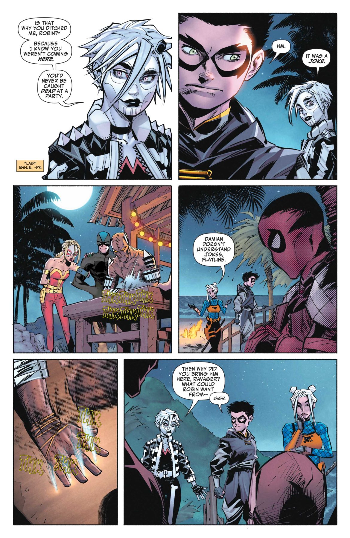
One of my favourite things in this issue is the relationship and dialogue between Damian Wayne and Rose Wilson. I don’t know if they’re supposed to be friends, or if Rose has mentally adopted Damian. Either way, Williamson has written their relationship brilliantly. Giving off Older sister, I won’t take any of your nonsense vibes, Rose forces Damian to do the one thing he hates the most. Socialise with other people.
Williamson’s done an amazing job of capturing Damian’s pure sass and disregard for other people’s emotions. In Robin #3 there is also the purest moment we’ve had so far. Everyone loves a good dad joke, but how about a good joke about a dad? Both Robin and Connor Hawke fans will get a real kick out of that. Damian and possible friend (please let them be friends) have you covered. Joshua Williamson really is doing amazing things with this series… and it is only 3 issues in!
The thing I love most about Williamson’s writing is the dialogue. Having a sit down chat with Damian and someone else was such a calming thing to do in the middle of DEATH ISLAND!
The artwork is so good, fight me about it
Gleb Melnikov has yet again smashed it out of the park. Just look at that artwork! So crisp, clean and mixed with the color work from Luis Guerrero is just *chef kiss*. Robin #3 is visually astonishing. I mean, Rose Wilson has cute little space buns and it just gives me all the warm happy feelings, which do not co-inside with the unhappy murder vibe island.
Looking at the character designs on each page is just a treat. We finally get to see a little more of some of the other characters and you can see the effort that’s gone into their creation, and the backgrounds are all stunning. Although there are things in there, your eye’s drawn to the action in the foreground. Using focal points like this is a great way to show the reader what they should be looking at, but it also shows the amount of effort going into each panel. Instead of just leaving a plain backgrounds, there are things to fill it out, even if they’re not necessary to the plot.

Conclusion
How dare you. I don’t need to be left hanging off a cliff like that! That’s just rude. Who raised you without manners… Talia Al Ghul? No… but really, come on man! That’s one way to get people to keep reading, make sure you blow their minds so they come back and need ALL OF THE ANSWERS.
I would also like to put in a formal petition to get Damian a best Island friend. There are only two correct answers to this. Yes… or you’ll just have to wait till Robin #4.

Images Courtesy of DC Entertainment


