Writer: Brenden Fletcher
Artist: Adam Archer
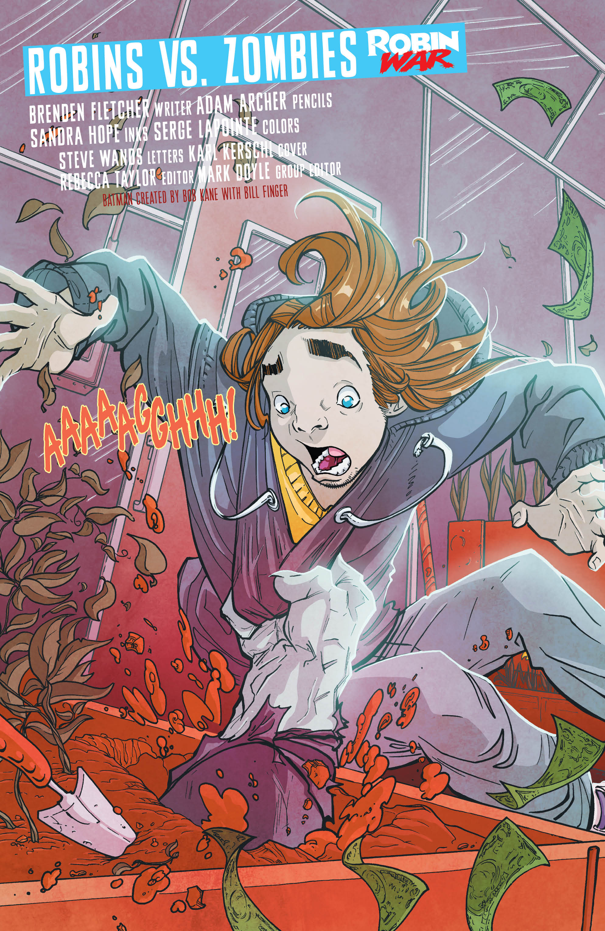
Well, it took awhile, but zombies finally made their way onto the pages of Gotham Academy.
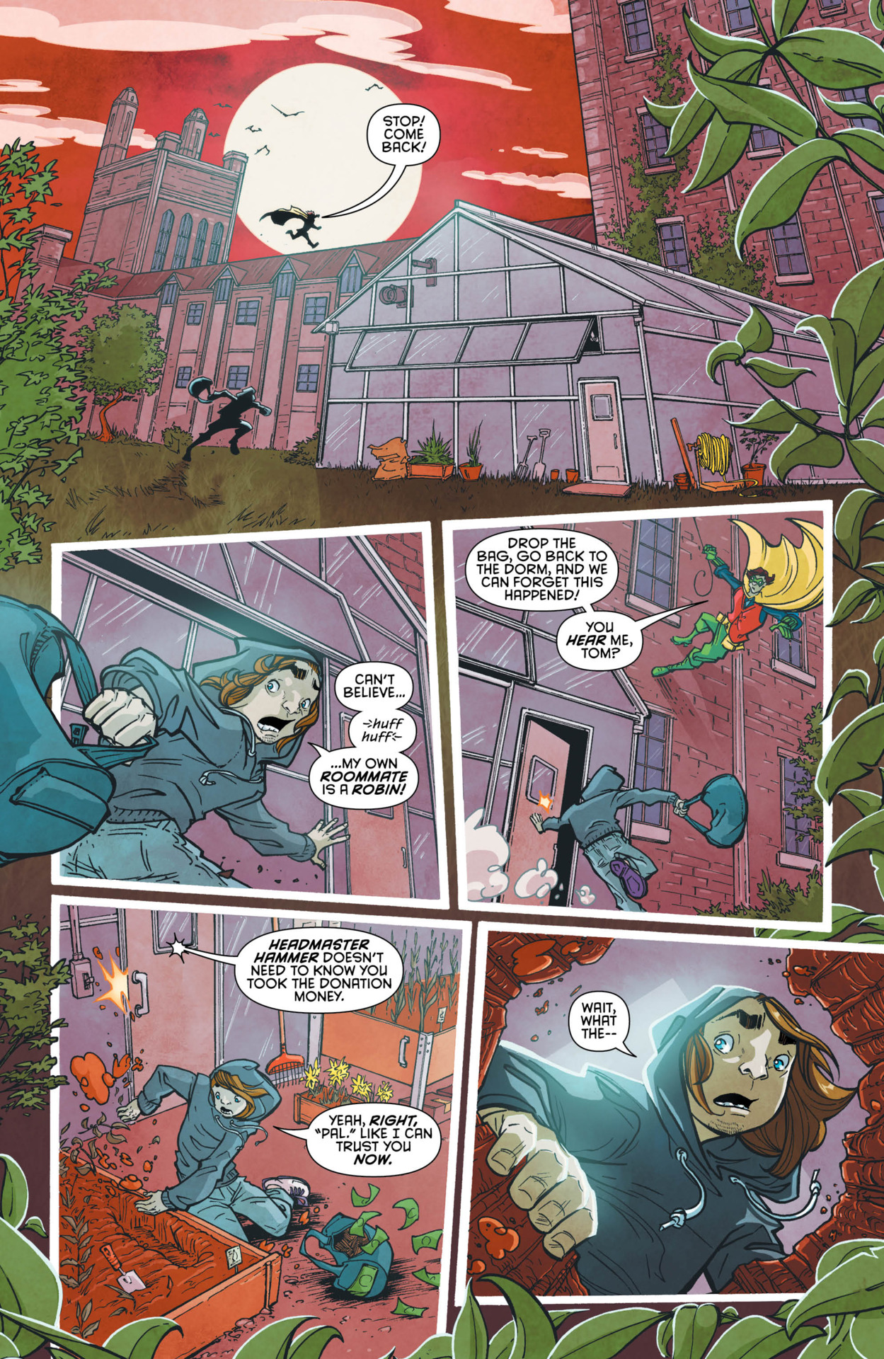
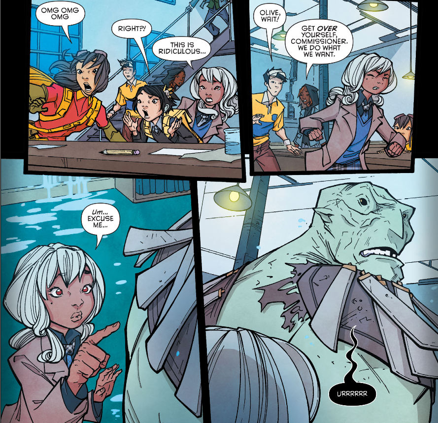
In this Robin War tie-in issue titled, Robins vs. Zombies, there’s not only undercover Robin’s hiding out on campus, but also a mysterious zombie parading around the grounds having risen from underneath the plants in the greenhouse.
I love the slick, seamless writing put forth by Brenden Fletcher in this issue which works both as a standalone storyline and an integral part of the Robin War campaign. There’s nothing better to make a story come to life than to have it to play well with the goings-on elsewhere within its given universe.
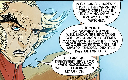
While most of the issue focuses on solving the zombie mystery, including locating and containing the undead creature, there are also several interesting, unlawful “Robin” sightings that crop up around the campus. The “unlawful” part stems from a recent police ban disallowing anyone from sporting a Robin-like appearance (see Robin War #1 for details). The ban immediately affects the school’s “mystery group” as Olive is called upon by the headmaster to befriend a new, temporary student (who we find out later is actually a secret Robin) whose only clandestine purpose for being at the school is to escape the scrutinizing eye of the law. There’s also a brief appearance by Damian Wayne in which he secretly visits Maps to warn her of the impending danger to her and the school as a result of the Robin War.
Now a word about the artwork. If you haven’t yet heard, beginning with this issue there’s a new artist, or possibly artists, taking over for Karl Kerschl—who announced via twitter last week that issue #12 would be his last work on the Gotham Academy series— to which I must admit is a bummer. The absence of a talent like Mr. Kerschl, particularly with his unique style which fit so perfectly with the Gotham Academy world, is bound leave a void and, in my opinion, already has. Although the artwork in this issue is good, it’s obliquely dissimilar to Karl’s. The huge shift in styles between the two artists causes the book to take on different look and feel. This difference, for me, is easily the biggest topic surrounding the issue and the future of the series. Again, I’m not judging it to be better or worse, just different.
With that said, I did enjoy this issue. It’s a smooth, light read that kept my interest peaked till the end. Given time to adjust my tastes, I’m sure the new art direction will take hold and become a satisfying new norm, I just wasn’t quite ready for it yet.
See Eric’s Review here.


