“A Family Thing”
 Writer: Shawn Martinbrough
Artists: Tony Akins, Moritat, Stefano Gaudiano
Color Artist: Paul Mounts
Letterer: Troy Peteri
Review by Adam Ray
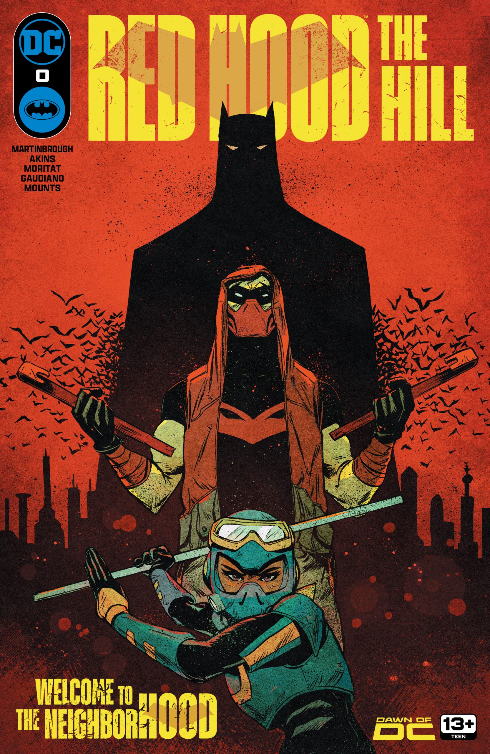
DC’s favorite anti-hero’s back, and recovering from the “Gotham War” as best he can. In Red Hood: The Hill #0, we see turbulent times in Gotham City forcing Jason Todd to strike up an old allegiance and caught in the middle of a new criminal element, all set to wonderfully striking character artwork.
This issue treats us to a great deal of Jason the man, as opposed to just his vigilante persona. There’s a welcome vulnerability to our boy in this issue, too, as we see him striking out on his own, rekindling an old flame, and handling the criminal elements with great skill.


There are so many layers to this character that have been under development since his first appearance in 1983. Seeing this layered characterization handled by creators who know his storied history and psychology is such a treat to behold.
The thing that strikes me most in this issue’s art is its character designs. The look of Red Hood is iconic but also seen just enough for him to shine, but not outshine the other characters. The distinction between the two Harlowe sisters feels like it must’ve been hard to do, as I’ve seen lesser artists give siblings (or even all their female characters) the same face.
The look of the weaponized football players is familiar but it’s refreshing to see it so well handled. There’s even a great level of design in the new antagonist; a neutral mask with just the tiniest details to show the wearer’s emotions is very welcome.
Conclusion
Red Hood The Hill: #0 does a great job of showing a human side to Jason Todd as he does his best to strike out alone as a hero in his own right. I’m now eager to see the story’s future, as it could truly go anywhere.
Images Courtesy of DC Entertainment