“Going Viral”
 Writer: Tom Taylor
Artists: Trevor Hairsine, Stefano Gaudiano and James Harren
Color Artist: Rain Beredo
Letterer: Saida Temofonte
Review by Steve J. Ray
The title alone is clever beyond belief. In a world overrun by what I call “Anti-social media” (where people are “Friends” online, they meet and date on the internet and there’s actually very little actual socialising happening) this story is timely, and eye-opening. I’m not one for spoilers, but the phrase “Going Viral” has never been more apt.
I’ve said it before; Tom Taylor is a genius. Giving a writer of his calibre stories like this (and Injustice), out of continuity tales where he can really cut loose, allow for some incredible storytelling. This opening issue alone makes Game Of Thrones look like The Wonderful World Of Disney.
Back in the day (1996, to be exact) Batman and his family were embroiled in a twelve issue crossover extravaganza entitled “Contagion.” This story tested the Dark Knight and his allies in a brand new way. This wasn’t a classic good versus evil story, there was no villain, no evil plot and no physical enemy. For the first time our heroes were given an enemy that they could’t punch, kick or outfight. A virus.
Tom Taylor has taken this ball, pumped it full of hydrogen, picked up a flamethrower, slowly started to release the gas… and run with it. Batman is a thinker, he found a way to combat a virus back in ’96 so, theoretically, could do the same again. Taylor’s brain has found a way around Batman’s cunning mind, to raise the threat levels in this opening chapter. His solution is nothing short of inspired. Harrowing, horrific, hair raising, but inspired nonetheless.
Life? Don’t Talk To Me About Life
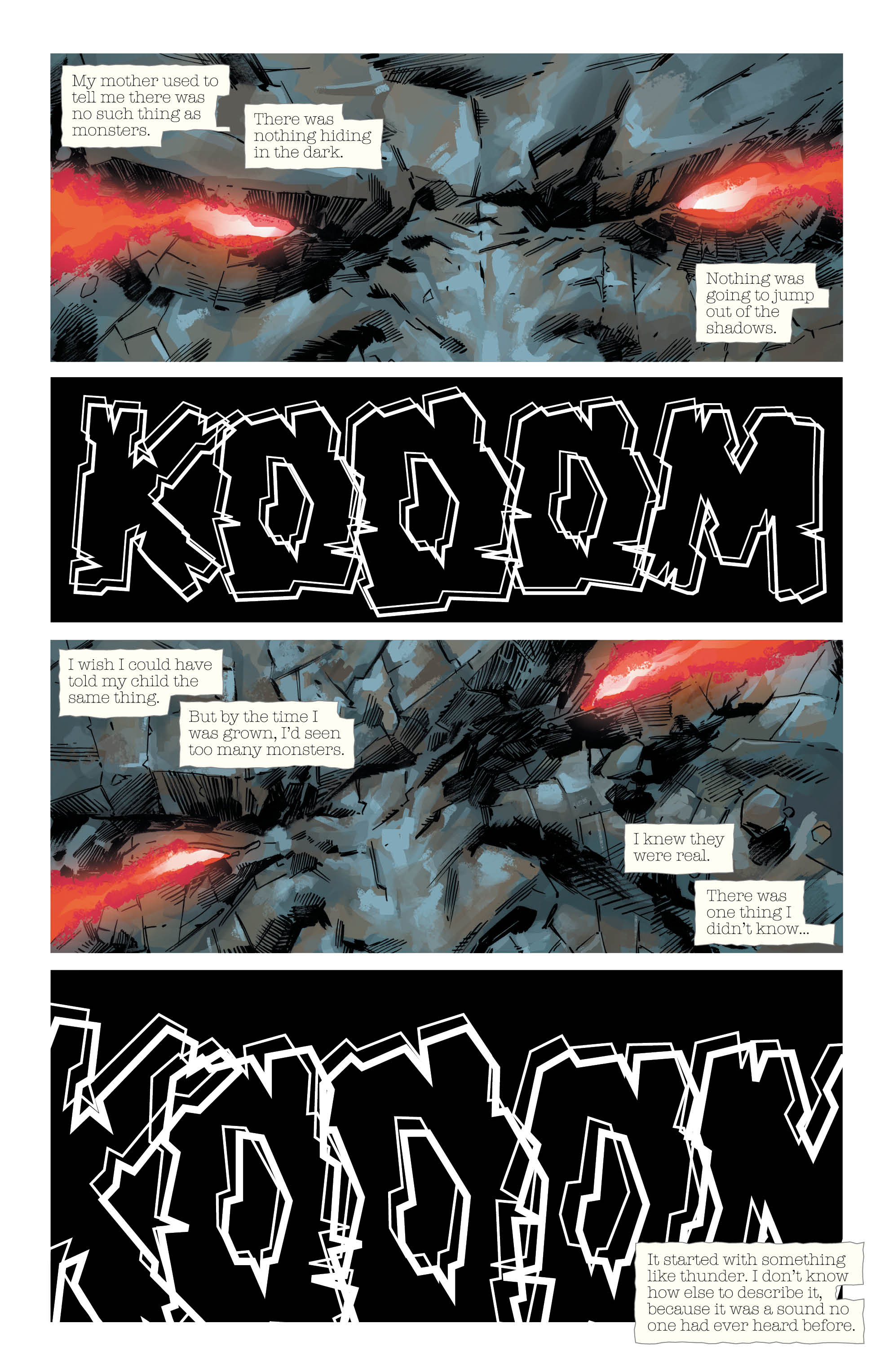
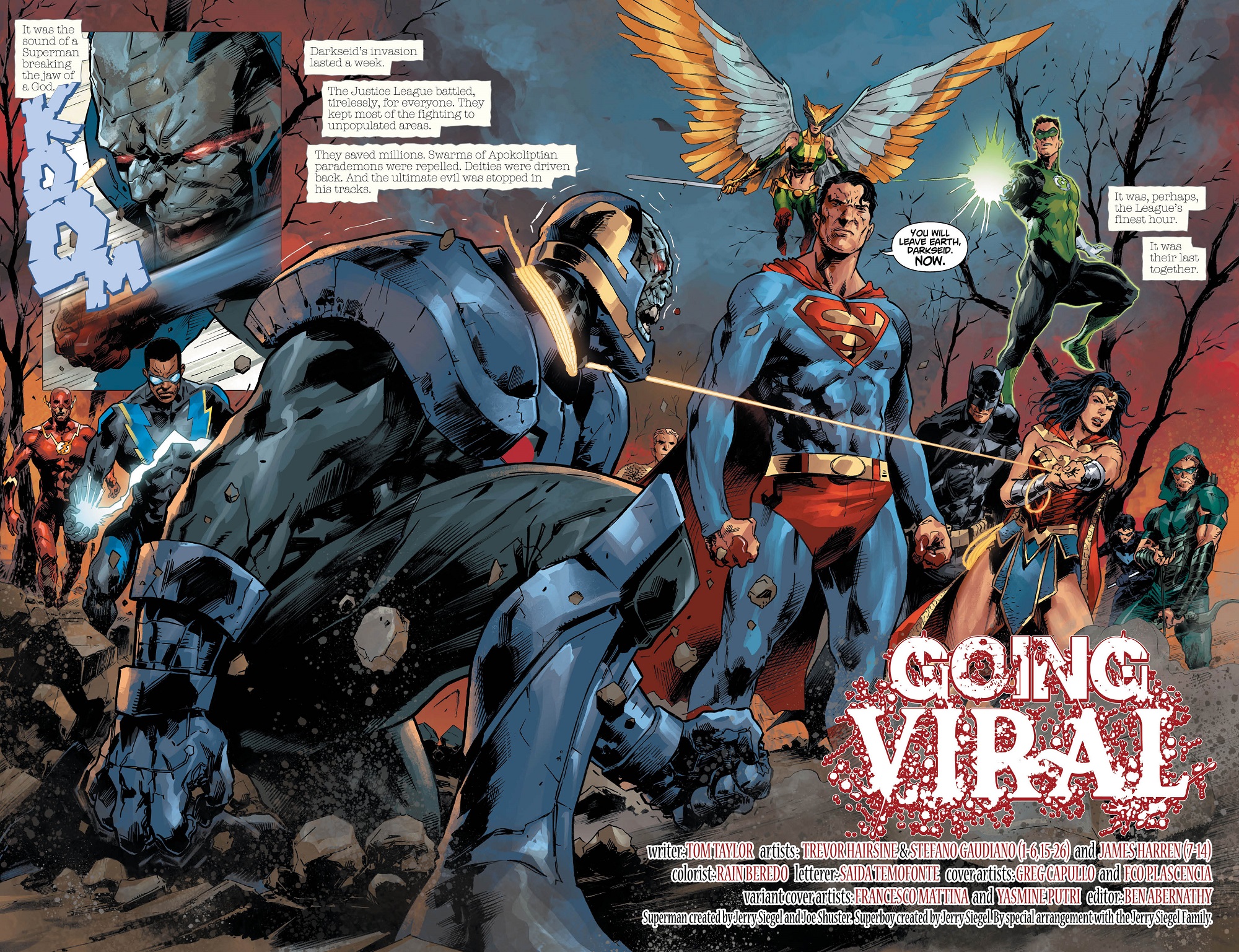
I’ve been a fan of Trevor Hairsine’s art since I first saw it back in Com.X’s brilliant mini-series Cla$$War. This guy isn’t a traditional comics artist; his work is quirky, atmospheric and toes the line between realism and caricature perfectly. I got really excited when he was announced as the main artist for DCeased, as that’s exactly the kind of style a zombie apocalypse (or should that be Apokolips?) story needs. The portions of this issue drawn by him, with inker Stefano Gaudiano, are gorgeous. I’m transported into a George Romero movie, or the very best episodes of The Walking Dead. These are some of the best interpretations of Darkseid and the Justice League I’ve seen in a long time. Check out the preview art attached to this review.
Rainier (A.K.A. Rain) Beredo is a stellar artist in his own right. He’s done some incredible work for DC’s Marvellous competition, so I’m overjoyed to see him applying his talents to DC’s pantheon of characters. His use of light is beautiful, as is the way he handles effects, like flames. The sunset in the opening scenes, which is clearly foreshadowing the events of the story, involve a forest that looks like it’s burning (it probably is); with dusky dark blues on one side, and the reds and oranges of a setting sun (or a world in flames) on the other. The effect is gorgeous. Look up, it’s all here. Oh, and Darkseid’s eyes. Brrrr… chilling.
I don’t recall ever seeing Saida Temofonte’s work before, but if this issue is anything to go by, I want to. Her lettering on this issue is top level. From her typeface font, opening the story, to that gorgeous “Going Viral” title, her work is the veritable ribbon on this complete package.
This Comic Is Almost Perfect…
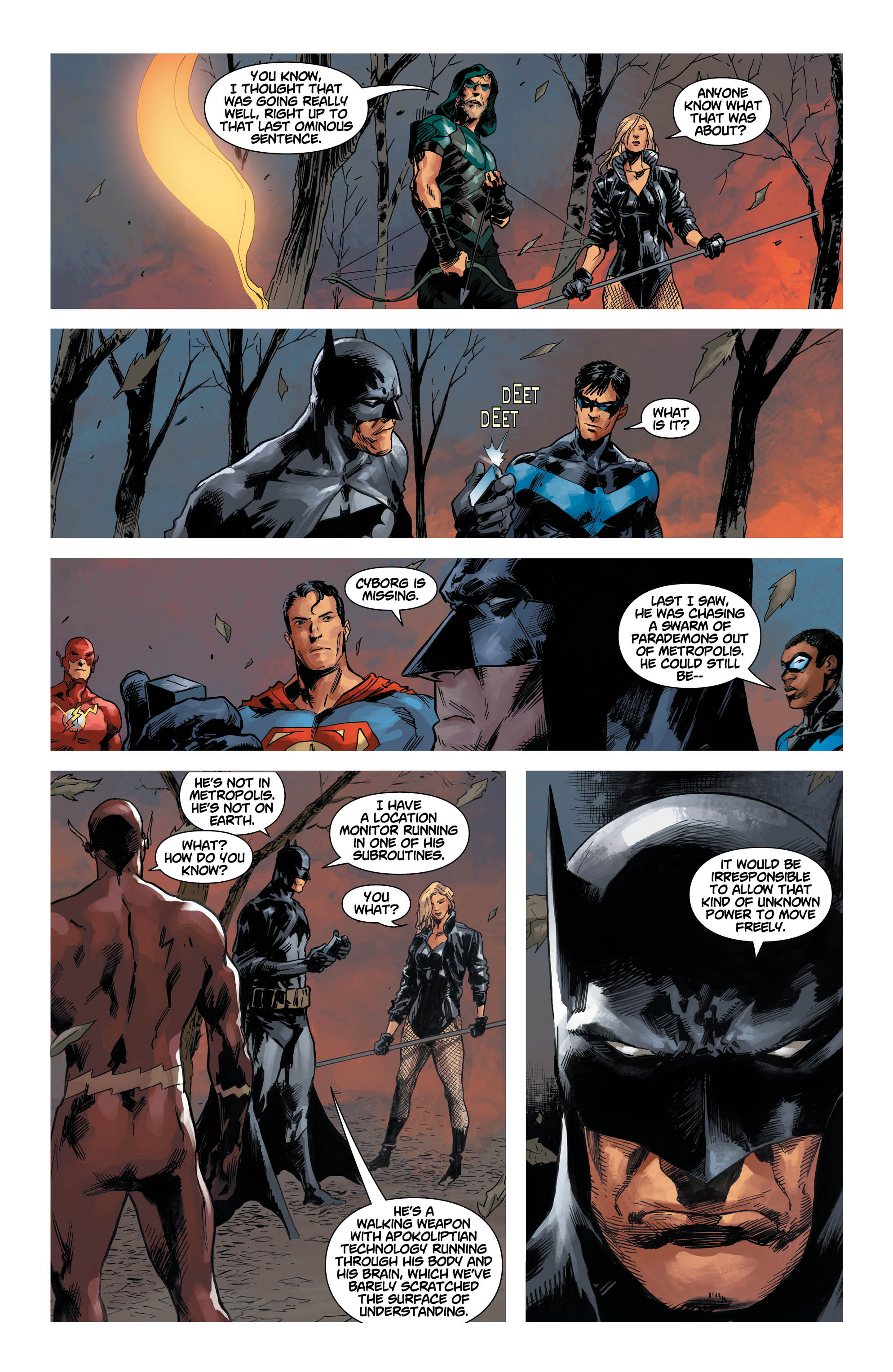
You may have noticed that I mentioned that the parts of the story drawn by Hairsine and Gaudiano are lovely, but the credits also mention James Harren. Pages 7-14 of this issue are handled by a different artist, over a third of the book as a whole. This is one of my comics bug-bears. Don’t get me wrong, Mr. Harren’s art is very, very good, but totally different to that of Hairsine and Gaudiano.
The clash of styles is extremely noticeable. His Cyborg is more traditional and cartoony than that of his fellow artists. There’s absolutely nothing wrong with that, but I found that it brought me out of the story for a while, and found it a little jarring. Having different artists draw flashback scenes, or parts of the narrative that are meant to break it up I find (just about) acceptable, but I’ve never liked it when it happens right in the middle of an ongoing story. I know that some people won’t even notice, but for me, this happening during a key scene, had an effect on my overall enjoyment of an otherwise perfect reading experience.
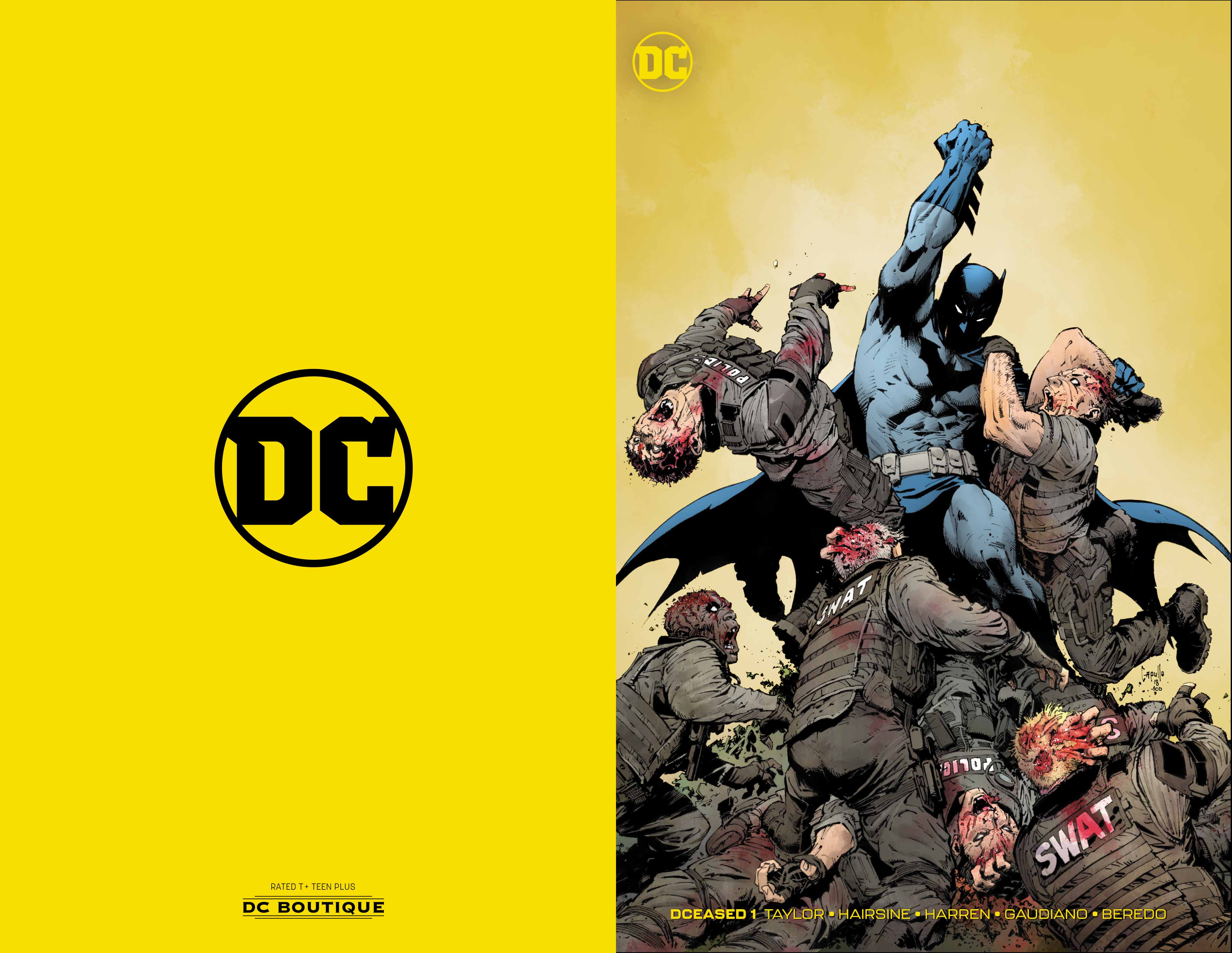
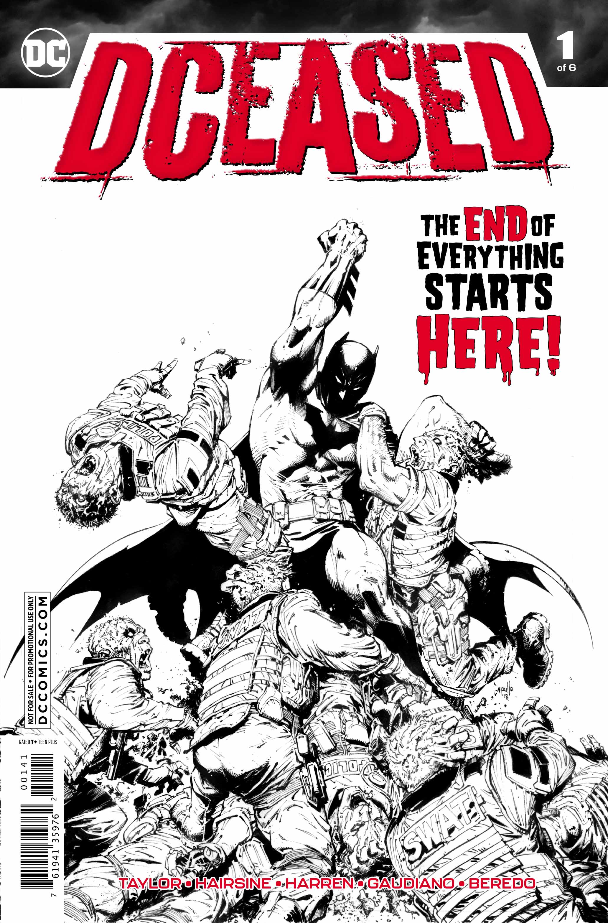
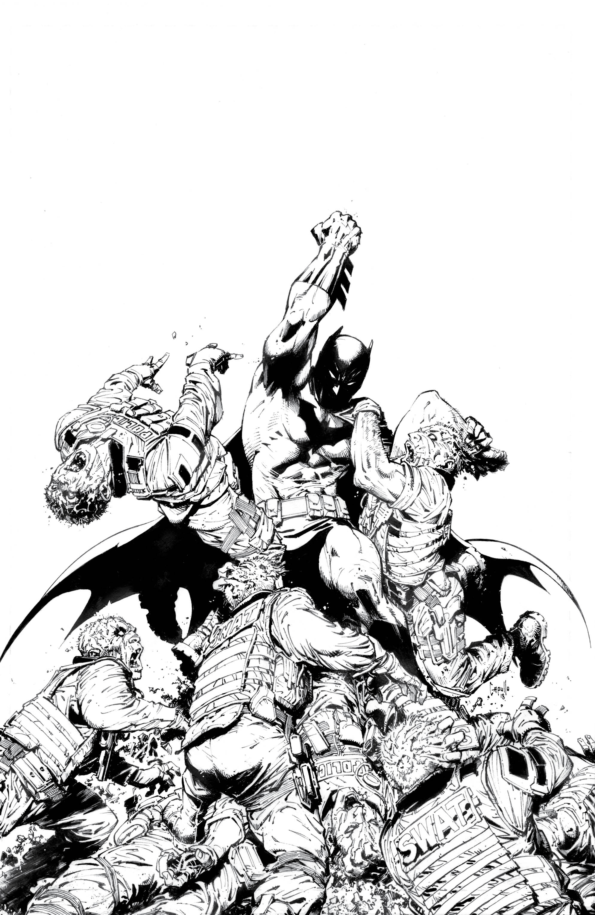
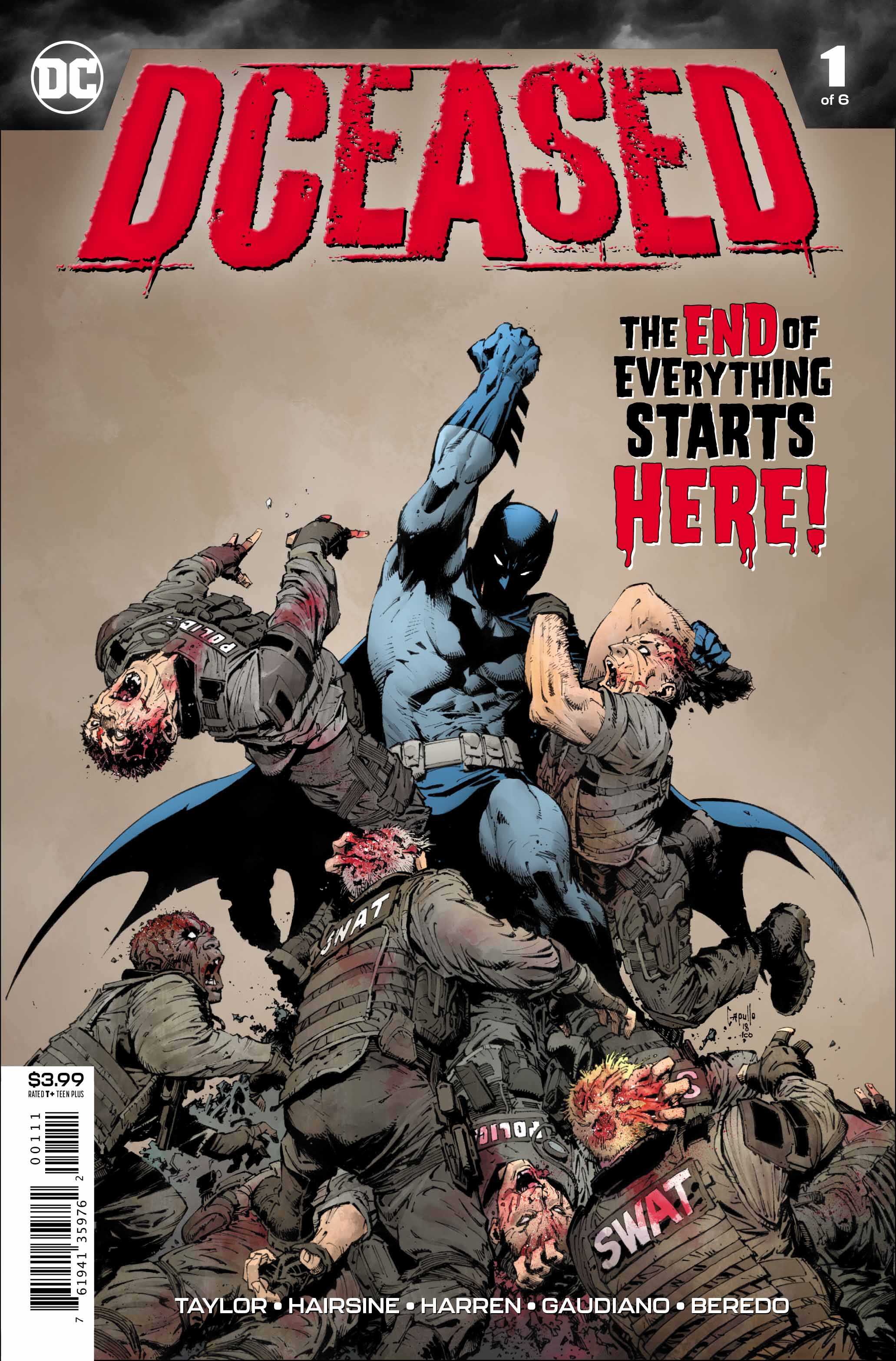
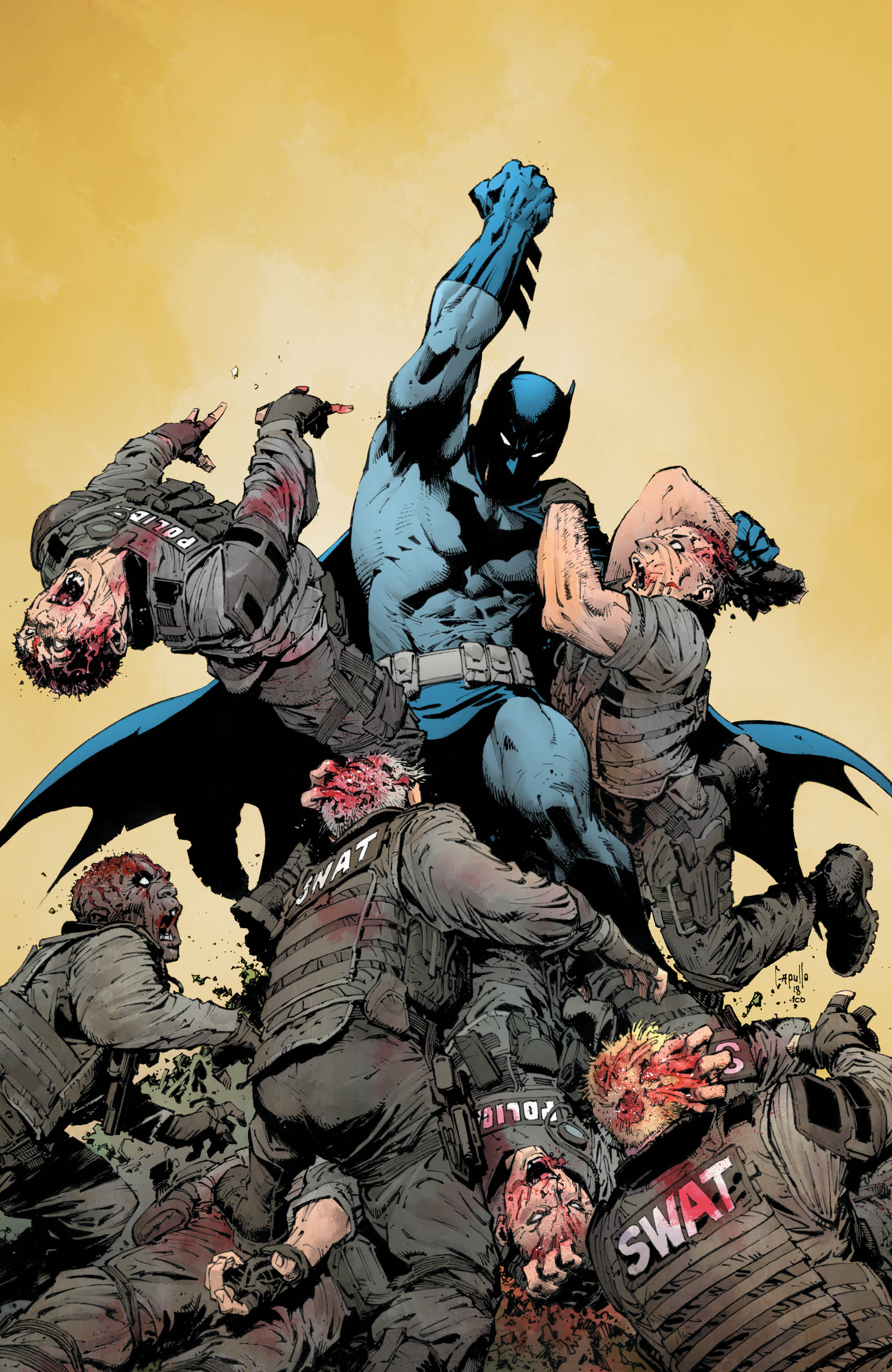
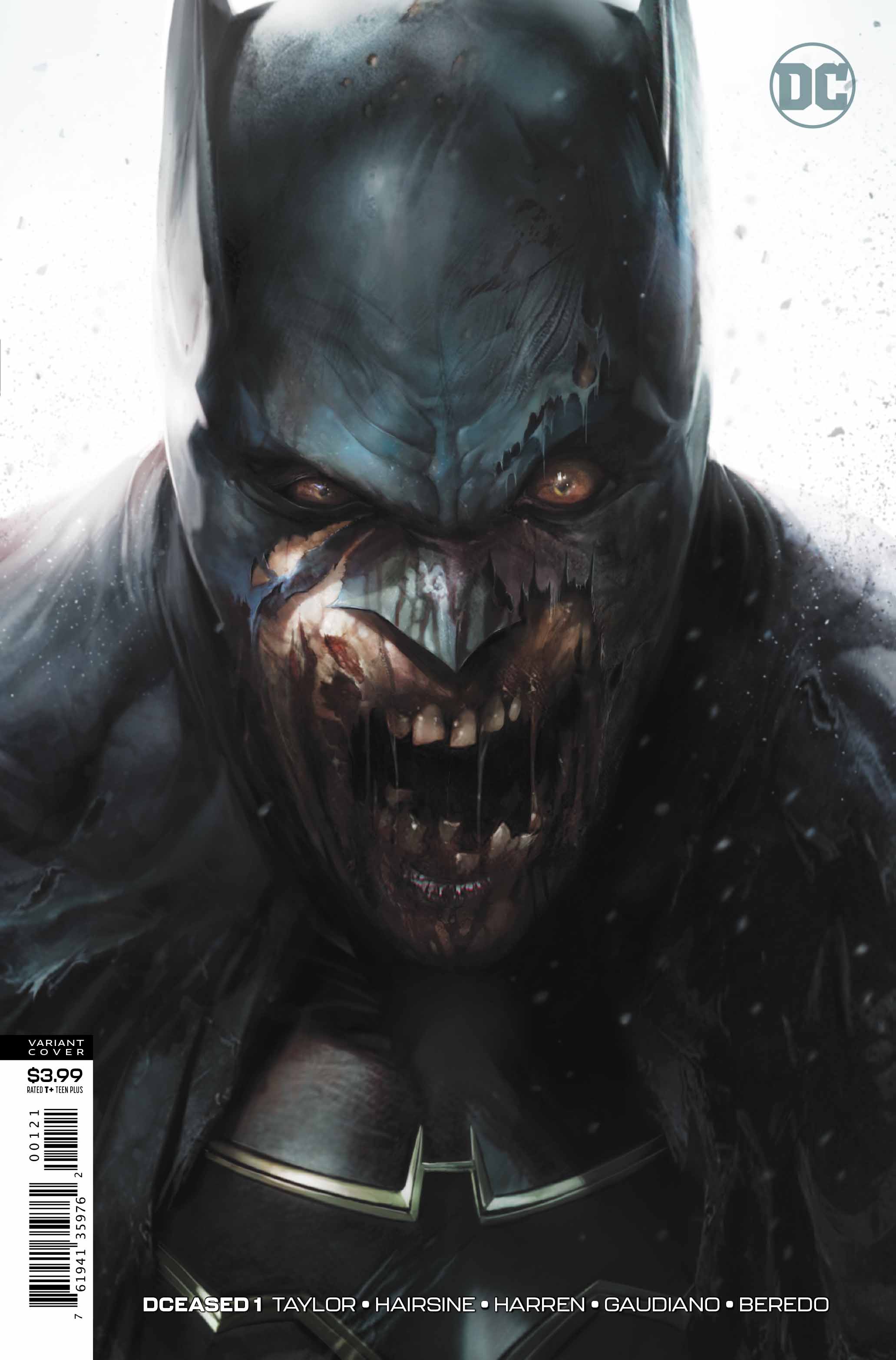
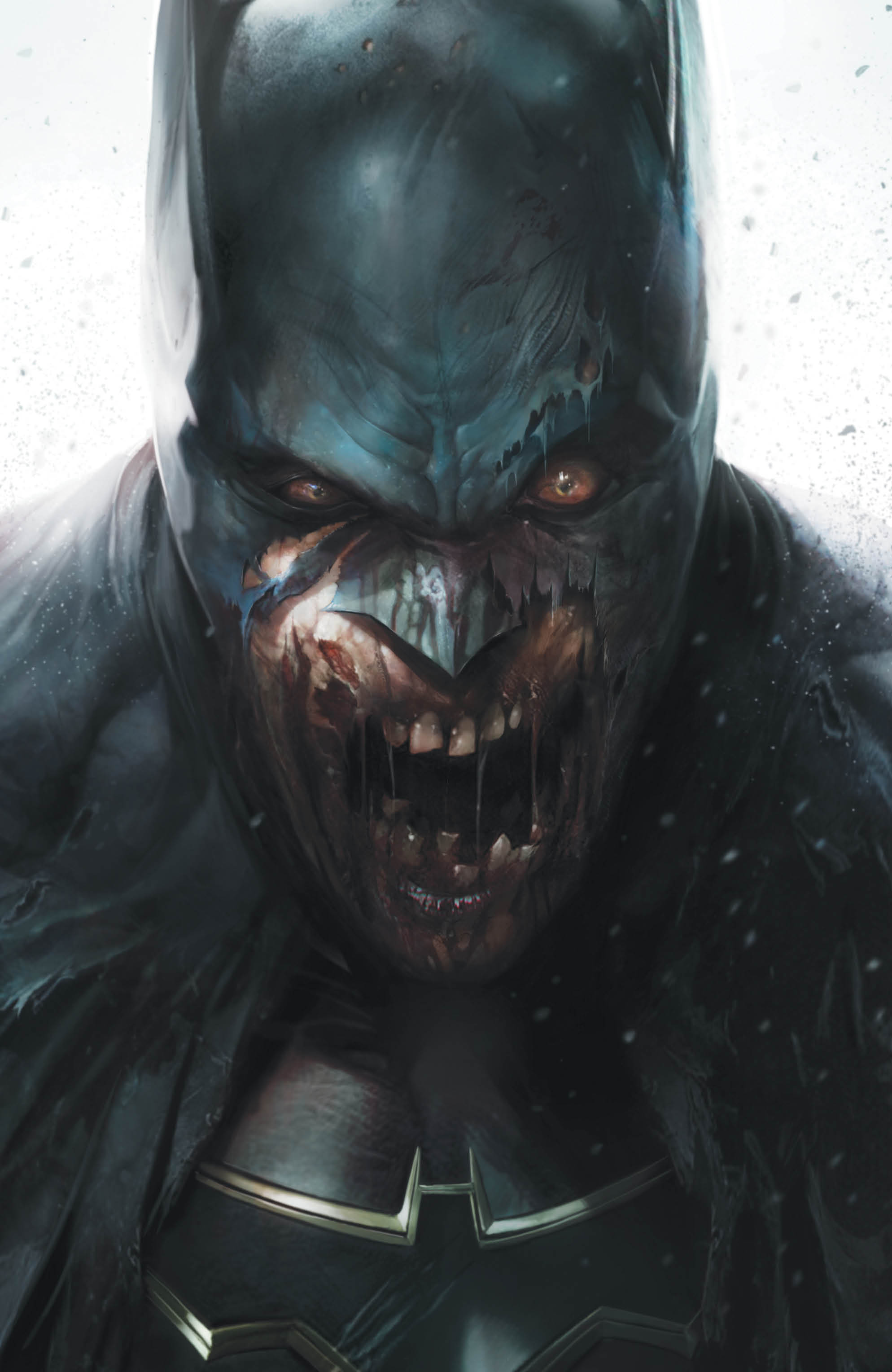
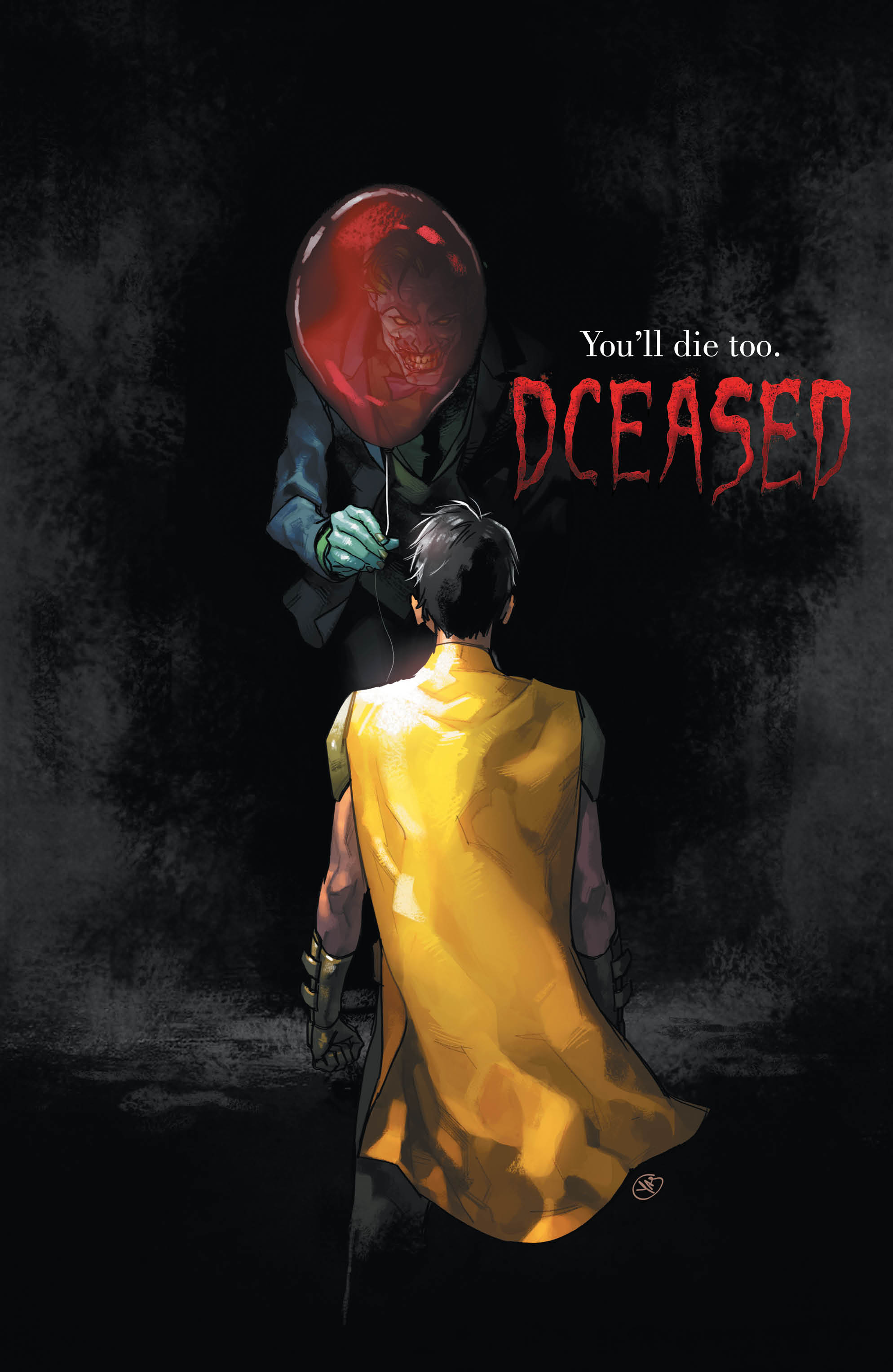
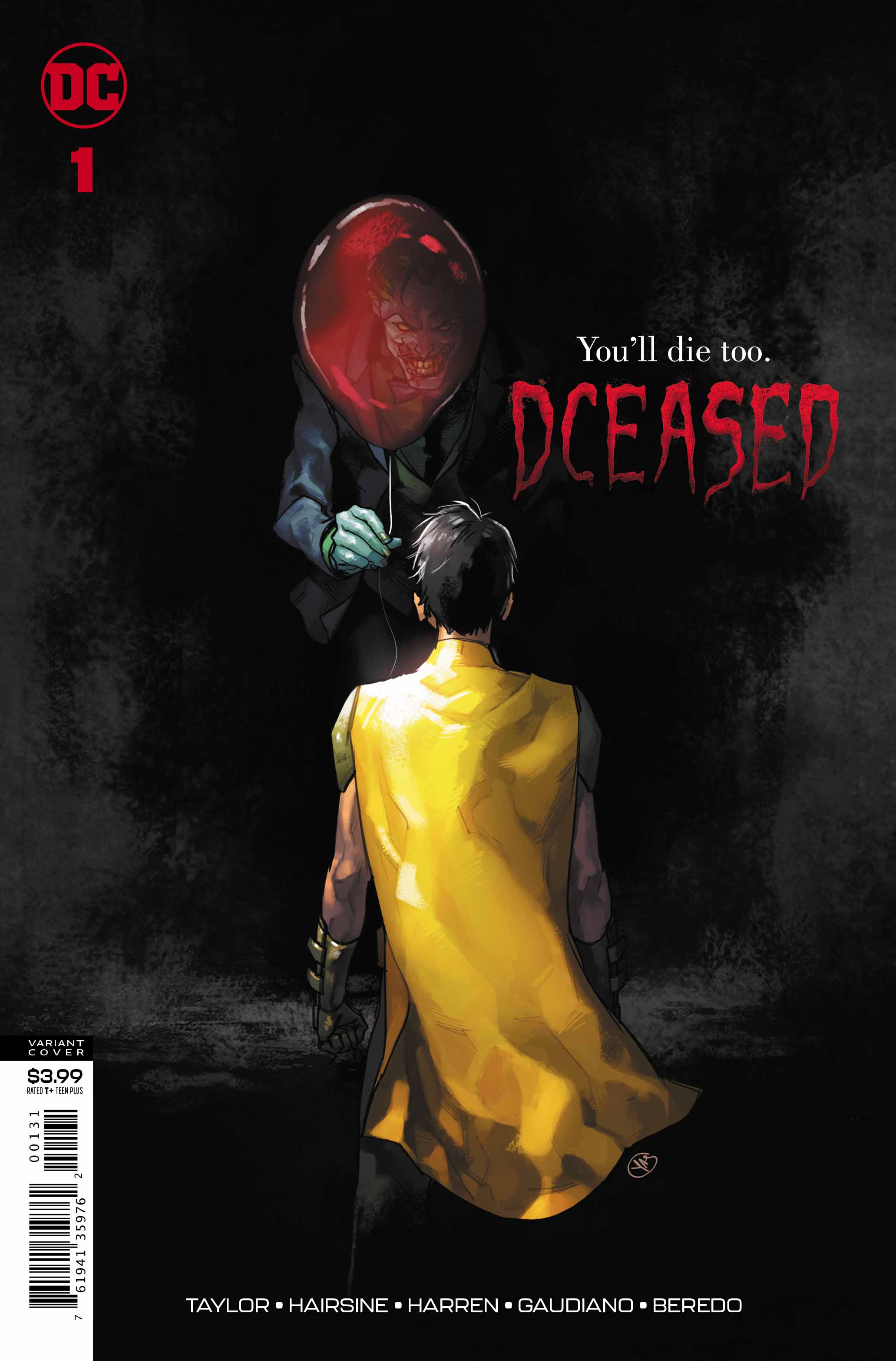
Oh, and the cover art! I’m not usually one to fall for the multiple covers ploy, but seriously… WOW! I may have to pick up every variant, the horror movie homage pieces especially. The painted covers by Francesco Mattina and Yasmine Putri for this issue knocked me dead.
Sorry…
Conclusion
From strong, but delicately handled social messages, to great storytelling and scenes of shock and awe, this series has started off extremely strong. This is a tale that will have people talking and has been a long time coming. I’m eagerly anticipating what Mr. Taylor and his amazing team of collaborators will deliver with the rest of this tale. The last three pages tore my heart out.
I’m sitting at a computer screen right now, and I’m anxious… I’ll never look at my smartphone the same way again.
More, please?
Images Courtesy Of DC Entertainment
